Contents
- 1 3d surface
- 2 magick
- 3 ĻĘĖļŻ╣ļ│ä ļČäĒżļź╝ 3ņ░©ņøÉņŖżļ¤ĮĻ▓ī ļ│┤ņØ┤ĻĖ░(ggjoy)
- 4 ggplot xņČĢ ļ╣äĒŗĆĻĖ░
- 5 ņ×öņ░© plot
- 6 ļ▓äļĖöņ░©ĒŖĖ(bubble chart)
- 7 area chart ņĢäļŗłĻ│Ā, ļ▓öņ£ä(ņāüĒĢ£~ĒĢśĒĢ£) ņśüņŚŁ ņ╣ĀĒĢśĻĖ░
- 8 ņØ┤ņżæņČĢ
- 9 abline, legend
- 10 ņØĖĒä░ļ×ÖĒŗ░ļĖī ĒöīļĪ»Ēīģ
- 11 xlab, ylab, title ņĪ░ņĀĢ
- 12 text
- 13 parallel plot?
- 14 ļ▓öļĪĆņØś ĻĘĖļ”╝Ēü¼ĻĖ░ ņĪ░ņĀł
- 15 xņČĢ ļØ╝ļ▓©ļ░öĻŠĖĻĖ░
- 16 xņČĢ ļéĀņ¦£ĒśĢņŗØ
- 17 ggplot2::stat_density2d()
- 18 boxplot.2d
- 19 ĻĖ░ļ│Ė scatter plot
- 20 ļ¦łņÜ░ņŖżļĪ£ Ēü┤ļ”ŁĒĢśņŚ¼ Ļ░Æ ņĢīņĢäļé┤ĻĖ░
- 21 smoothScatter
- 22 ggpairs
- 23 pairs(ņ╗żņŖżĒä░ļ¦łņØ┤ņ¦ĢļÉ£)
- 24 Spider(Radar) Chart
[edit]
1 3d surface #
https://stackoverflow.com/questions/41700400/smoothing-3d-plot-in-r
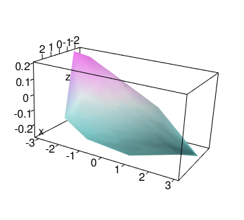
library(mgcv)

x<- rnorm(200)
y<- rnorm(200)
z<-rnorm(200)

tab<-data.frame(x,y,z)
tab

#surface wireframe:

mod <- gam(z ~ te(x, y), data = tab)

library(rgl)
library(deldir)

zfit <- fitted(mod)
col <- cm.colors(20)[1 +
         round(19*(zfit - min(zfit))/diff(range(zfit)))]

persp3d(deldir(x, y, z = zfit), col = col)
aspect3d(1, 2, 1)
[edit]
3 ĻĘĖļŻ╣ļ│ä ļČäĒżļź╝ 3ņ░©ņøÉņŖżļ¤ĮĻ▓ī ļ│┤ņØ┤ĻĖ░(ggjoy) #
- http://rpubs.com/ianrmcdonald/293304
- http://mran.microsoft.com/web/packages/ggjoy/vignettes/gallery.html
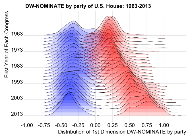
--ņČ£ņ▓ś: http://rpubs.com/ianrmcdonald/293304
ļŹö ņØ┤ņüśĻ▓ī..
[edit]
4 ggplot xņČĢ ļ╣äĒŗĆĻĖ░ #
ggplot(df1, aes(x=grp, y=val)) + geom_boxplot(outlier.shape = NA) + ylim(0, 30) + theme(axis.text.x = element_text(angle = 90, hjust = 1))
- 45ļÅä ļ╣äĒŗĆĻĖ░: theme(axis.text.x = element_text(angle = 45, hjust = 1))
- 90ļÅä ļ╣äĒŗĆĻĖ░: theme(axis.text.x = element_text(angle = 90, hjust = 1))
[edit]
5 ņ×öņ░© plot #
--Practical Data Science with R, ISBN 978-1-61729-156-2
d <- data.frame(y=(1:10)^2,x=1:10)
model <- lm(y~x,data=d)
d$prediction <- predict(model,newdata=d)

library('ggplot2')
ggplot(data=d) + geom_point(aes(x=x,y=y)) +
geom_line(aes(x=x,y=prediction),color='blue') +
geom_segment(aes(x=x,y=prediction,yend=y,xend=x)) +
scale_y_continuous('')
[edit]
6 ļ▓äļĖöņ░©ĒŖĖ(bubble chart) #
dfx = data.frame(ev1=1:10, ev2=sample(10:99, 10), ev3=10:1)
symbols(x=dfx$ev1, y=dfx$ev2, circles=dfx$ev3, inches=1/3, ann=F, bg="steelblue2", fg=NULL)
[edit]
7 area chart ņĢäļŗłĻ│Ā, ļ▓öņ£ä(ņāüĒĢ£~ĒĢśĒĢ£) ņśüņŚŁ ņ╣ĀĒĢśĻĖ░ #
polygon(c(x, rev(x)), c(y$upr, rev(y$lwr)), col = "gray", border = NA)
[edit]
8 ņØ┤ņżæņČĢ #
plotrix Ēī©Ēéżņ¦Ć ņ░ĖĻ│Ā ļ░Å ņČ£ņ▓ś --> http://rpubs.com/cardiomoon/19042
library("plotrix")
going_up <- seq(3, 7, by = 0.5) + rnorm(9)
going_down <- rev(60:74) + rnorm(15)

twoord.plot(2:10, going_up, 1:15, going_down, xlab = "Sequence", ylab = "Ascending values",
            rylab = "Descending values", lcol = 4, main = "Plot with two ordinates - points and lines",
            do.first = "plot_bg();grid(col=\"white\",lty=1)")

twoord.plot(2:10, going_up, 1:15, going_down, xlab = "Sequence", lylim = range(going_up) +
              c(-1, 10), rylim = range(going_down) + c(-10, 2), ylab = "Ascending values",
            ylab.at = 5, rylab = "Descending values", rylab.at = 65, lcol = 4, main = "Plot with two ordinates - separated lines",
            lytickpos = 3:7, rytickpos = seq(55, 75, by = 5), do.first = "plot_bg();grid(col=\"white\",lty=1)")
ļŗżļźĖ ņśłņĀ£
set.seed(2015-04-13)
d = data.frame(x =seq(1,10),
n = c(0,0,1,2,3,4,4,5,6,6),
logp = signif(-log10(runif(10)), 2))
#ņóī
par(mar = c(5,5,2,5))
with(d, plot(x, logp, type="l", col="red3",
ylab=expression(-log[10](italic(p))),
ylim=c(0,3)))
#ņÜ░
par(new = T)
with(d, plot(x, n, pch=16, axes=F, xlab=NA, ylab=NA, cex=1.2))
axis(side = 4)
mtext(side = 4, line = 3, 'Number genes selected')
legend("topleft",
legend=c(expression(-log[10](italic(p))), "N genes"),
lty=c(1,0), pch=c(NA, 16), col=c("red3", "black"))
--ņČ£ņ▓ś: http://www.r-bloggers.com/r-single-plot-with-two-different-y-axes/[edit]
9 abline, legend #
library(party)
library(caret)
gtree <- ctree(Species ~ ., data = iris)
plot(gtree)

attach(iris)
colour <- c("black", "red", "blue")
plot(Petal.Width, Petal.Length, pch=20, col=c(colour[Species]))
abline(h=4.8, col="blue", lty=2);text(0.75,5,"Petal.Length > 4.8", col="blue")
abline(h=1.9, col="black", lty=2);text(1,2.2,"Petal.Length > 1.9", col="black")
abline(v=1.7, col="red", lty=2);text(2,4,"Petal.Width > 1.7", col="red")
legend(0.1, 6.5, c("setosa","versicolor", "virginica"), pch=20, col=colour)
![[https]](/moniwiki/imgs/https.png)
[edit]
11 xlab, ylab, title ņĪ░ņĀĢ #
for(i in 1:max(cl$cluster)){
  p_cluster <- ggplot(tmp[tmp$cluster == i, ], aes(x=variable, y=value, colour=factor(cluster)))
  p_cluster + geom_line() + ggtitle(paste0("cluster", i))+theme(axis.text=element_text(size=20),
  axis.title=element_text(size=20,face="bold"),plot.title=element_text(family="Times", face="bold", size=20))
  ggsave(file=paste0("c:\\plot\\cluster", i, ".png"))
}
[edit]
12 text #
prior <- seq(0, 1, 0.1)
posterior <- (piror*1/2)/(piror*1/2+(1-piror)*0.09)
plot(prior, posterior, main="ņ╣£ņ×ÉĒÖĢņØĖņåīņåĪ", type="l")
abline(0,1)
abline(h=0.5, v=0.5)
point_label <- paste0("(", prior,", ", round(posterior, 3), ")")
text(prior, posterior, point_label, cex=0.8, pos=4, col="red")
[edit]
14 ļ▓öļĪĆņØś ĻĘĖļ”╝Ēü¼ĻĖ░ ņĪ░ņĀł #
p<-ggplot(df, aes(x=ņØ╝ņ×É, y=Ļ▓īņ×äņłś, colour=ņןļź┤)) + geom_point(size=4) + facet_wrap( ~ ĻĄŁĻ░Ć, nrow=3)
p + theme(
strip.text.x = element_text(size=20),
legend.title = element_text(size=20, face="bold"),
legend.text = element_text(size = 20, face = "bold")) +
guides(size=10,colour = guide_legend(override.aes = list(size=7)))
[edit]
15 xņČĢ ļØ╝ļ▓©ļ░öĻŠĖĻĖ░ #
plot(tmp1$stage_no, tmp1$md, axes = FALSE, xlab="ņŖżĒģīņØ┤ņ¦Ć", ylab="ņĀĢņ▓┤ĒīÉņłś") axis(1, tmp1$stage_no,tmp1$stage_nm, las=2) #las=2ļŖö ļØ╝ļ▓©ņØä ņäĖļĪ£ļĪ£ axis(2);box()
[edit]
16 xņČĢ ļéĀņ¦£ĒśĢņŗØ #
library(ggplot2)
library("scales") #date_format()
ggplot(loess.df, aes(x=dt, y=s)) + geom_point() + geom_smooth() +
labs(x = "ņØ╝ņ×É", y = "ņØ╝ ņŗ£ņןĻĘ£ļ¬©(ņ¢Ą)") +
scale_x_date(labels = date_format("%Y-%m"))
#xaxt='n' ņśĄņģśņØä ņżśņĢ╝ĒĢ£ļŗż. plot(df$dt, df$amt, type="l", xaxt='n') axis.Date(side=1, df$dt, format = "%Y-%m-%d") #strptime(x1, "%Y-%m-%d %H:%M:%OS")
[edit]
17 ggplot2::stat_density2d() #
2ņ░©ņøÉ ĻĘĖļלĒöäļĪ£ ņé░ņĀÉļÅäļĪ£ļŖö ņל ļ│┤ņØ┤ņ¦Ć ņĢŖļŖö ļŹ░ņØ┤Ēä░ļōżņØś ĻĘĖļŻ╣ņØä ņŗØļ│äĒĢśĻĖ░ ņóŗļŗż.
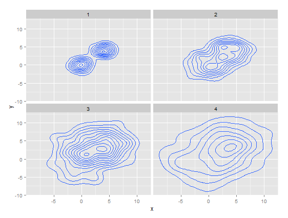
rs <- data.frame()
for(i in 1:4){
    x <- c(rnorm(200,0,i),rnorm(200,4,i))
    y <- c(rnorm(200,0,i),rnorm(200,4,i))
    grp <- replicate(length(x), i)
    rs <- rbind(rs, data.frame(grp, x, y))
}

library(ggplot2)
p <- ggplot(rs, aes(x=x, y=y))
p + stat_density2d() + facet_wrap( ~ grp, nrow=2)
[edit]
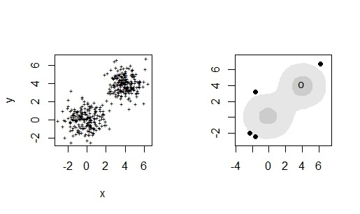
18 boxplot.2d #
#install.packages("hdrcde")
library("hdrcde")

x <- c(rnorm(200,0,1),rnorm(200,4,1))
y <- c(rnorm(200,0,1),rnorm(200,4,1))

par(mfrow=c(2,2))
plot(x,y, pch="+", cex=.5)
hdr.boxplot.2d(x,y)
plot(hdr.2d(x, y), pointcol="red", show.points=TRUE, pch=3)
par(mfrow=c(1,1))
[edit]
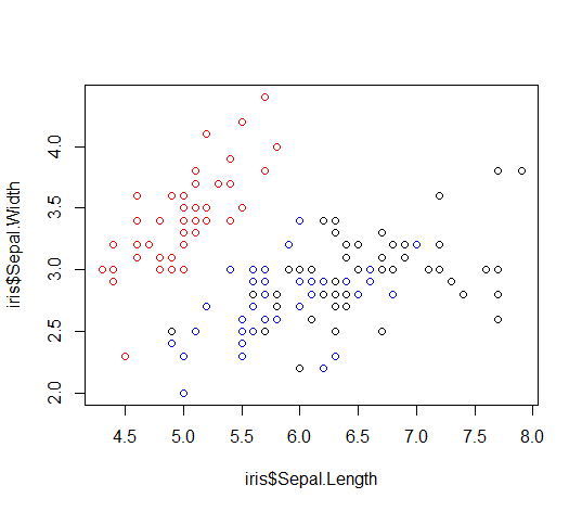
19 ĻĖ░ļ│Ė scatter plot #
colour <- c("red", "blue", "black")
plot(iris$Sepal.Length, iris$Sepal.Width, col=c(colour[iris$Species]))
[edit]
20 ļ¦łņÜ░ņŖżļĪ£ Ēü┤ļ”ŁĒĢśņŚ¼ Ļ░Æ ņĢīņĢäļé┤ĻĖ░ #
plot(dau ~ dau_pred, data=grossing)
identify() ĒĢ©ņłśļź╝ ņé¼ņÜ®ĒĢśļ®┤ ņĢīĻ│Āņ×É ĒĢśļŖö Ļ░ÆļōżņØä Ēü┤ļ”Ł Ēøä escļź╝ ļłäļź┤ļ®┤ ņ░©ĒŖĖņŚÉ Ēü┤ļ”ŁļÉ£ Ļ││ņØś Ļ░ÆņØä ņØĖņŗØĒĢ£ļŗż.
#rowname()ņØ┤ ņ░©ĒŖĖņŚÉ ņ░ŹĒ×īļŗż.
identify(grossing$dau_pred, grossing$dau, labels=row.names(grossing))
#x,yĻ░ÆņØ┤ ņ░ŹĒ×īļŗż. ļ¼╝ļĪĀ escļź╝ ļłīļĀĆņØä ļĢīņŚÉ ņł£ņä£ļīĆļĪ£ rownameļÅä ņČ£ļĀźļÉ£ļŗż.
identify(grossing$dau_pred, grossing$dau, labels=paste0("x=",grossing$dau_pred, "\ny=", grossing$dau))
ņĢäļלņØś ņĮöļō£ļŖö identify() ĒĢ©ņłśņÖĆ ļŗ¼ļ”¼ Ēü┤ļ”ŁĒĢśņ×Éļ¦łņ×É Ļ░ÆņØä ņĢī ņłś ņ׳ļŗż.
repeat {
  click.loc <- locator(1)
  if(!is.null(click.loc)){
      text( x = click.loc$x, y = click.loc$y,
            labels = paste0("x=",round(click.loc$x,0), "\ny=", round(click.loc$y)),
            cex = 0.8, col = "blue" )
  }
  else break
}
[edit]
21 smoothScatter #
ņØ╝ļ░śņĀüņ£╝ļĪ£ ņé░ņĀÉļÅä(scatter plot)ļź╝ ĻĘĖļ”¼ļ®┤ ļŗżņØīĻ│╝ Ļ░Öļŗż.

plot(x,y)
ĻĘĖļ¤░ļŹ░, ļŹ░ņØ┤Ēä░ņØś ņ¢æņØ┤ ļ¦Äņ£╝ļ®┤ ņ£äņÖĆ Ļ░ÖņØ┤ ļŹ░ņØ┤Ēä░ņØś ļČäĒżļź╝ ĒīīņĢģĒĢśĻĖ░ ņ¢┤ļĀĄļŗż. smoothScatter()ļŖö ņØ┤ļ¤░ ņ¢┤ļĀżņøĆņØä ĻĘ╣ļ│ĄĒĢĀ ņłś ņ׳Ļ▓ī ņŗ£Ļ░üĒÖö ĒĢ┤ņżĆļŗż. ņĢäļלņØś ĻĘĖļ”╝ņØä ļ│┤ļ®┤ 3Ļ░£ ņĀĢļÅäņØś ĻĄ░ņ¦æņØ┤ ņ׳ļŖö Ļ▓āņØä ĒÖĢņØĖ ĒĢĀ ņłś ņ׳ļŗż.

library(graphics)
smoothScatter(x, y)
[edit]
22 ggpairs #
pairs()ĒĢ©ņłśļŖö data.frameņŚÉ ļīĆĒĢ┤ ņé░ņĀÉļÅäļź╝ ĻĘĖļĀżņżĆļŗż. ņØ┤ ņ×Éņ▓┤ļĪ£ļÅä ņĀĢļ│┤Ļ░Ć ļ¦Äņ¦Ćļ¦ī, ļŹöņÜ▒ ļ¦ÄņØĆ ņĀĢļ│┤ļź╝ ņżä ņłś ņ׳ļŖö ņé░ņĀÉļÅäļÅä ņ׳ļŗż. ĻĘĖĻ▓ī ggpairs()ļŗż. ļŗ©ņĀÉņØĆ ļŖÉļ”¼ļŗżļŖö Ļ▓ā.
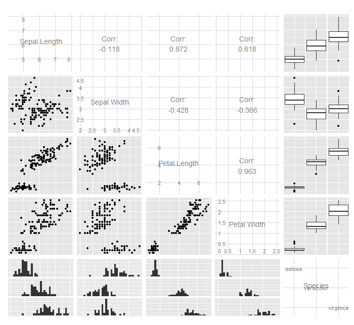
library("GGally")
ggpairs(iris)
[edit]
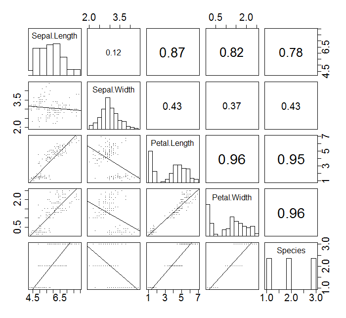
23 pairs(ņ╗żņŖżĒä░ļ¦łņØ┤ņ¦ĢļÉ£) #
panel.cor <- function(x, y, digits=2, prefix="", cex.cor, ...) {
usr <- par("usr")
on.exit(par(usr))
par(usr = c(0, 1, 0, 1))
r <- abs(cor(x, y, use="complete.obs"))
txt <- format(c(r, 0.123456789), digits=digits)[1]
txt <- paste(prefix, txt, sep="")
if(missing(cex.cor)) cex.cor <- 0.8/strwidth(txt)
text(0.5, 0.5, txt, cex = cex.cor * (1 + r) / 2)
}
panel.hist <- function(x, ...) {
usr <- par("usr")
on.exit(par(usr))
par(usr = c(usr[1:2], 0, 1.5) )
opar=par(ps=30) #font-size
h <- hist(x, plot = FALSE)
breaks <- h$breaks
nB <- length(breaks)
y <- h$counts
y <- y/max(y)
rect(breaks[-nB], 0, breaks[-1], y, col="white", ...)
}
panel.lm <- function (x, y, col = par("col"), bg = NA, pch = par("pch"),
cex = 1, col.smooth = "black", ...) {
points(x, y, pch = pch, col = col, bg = bg, cex = cex)
abline(stats::lm(y ~ x), col = col.smooth, ...)
}
pairs(iris, pch=".",
upper.panel = panel.cor,
diag.panel = panel.hist,
lower.panel = panel.lm)
#ļśÉļŖö ļ╣äļ¬©ņłś
panel.lowess <- function (x, y, col = par("col"), bg = NA, pch = par("pch"),
cex = 1, col.smooth = "black", ...) {
points(x, y, pch = pch, col = col, bg = bg, cex = cex)
lines(lowess(x,y))
}
pairs(iris, pch=".",
upper.panel = panel.cor,
diag.panel = panel.hist,
lower.panel = panel.lowess)
[edit]
24 Spider(Radar) Chart #
tmp <- df[df$job_id == i, 4:7]
title <- head(df[df$job_id == i, 2],1)
tmp <- rbind(rep(12000,4) , rep(0,4), tmp) #max, minĻ░ÆņØä ņäĖĒīģĒĢ┤ņĢ╝ ĒĢ©.
rownames(tmp) <- c("1", "2", "Active", "Churn")
colors_border <- c( rgb(0.2,0.5,0.5,0.9), rgb(0.8,0.2,0.5,0.9) , rgb(0.7,0.5,0.1,0.9) )
colors_in <- c( rgb(0.2,0.5,0.5,0.4), rgb(0.8,0.2,0.5,0.4) , rgb(0.7,0.5,0.1,0.4))
#radarchart(tmp, axistype=1, pcol=colors_border, plwd=2, plty=1, axislabcol="grey", cglcol="gray", caxislabels=seq(0,12000,2000), cglwd=0.8, vlcex=0.8, seg=4, title=title)
radarchart(tmp, axistype=1, pcol=colors_border, plwd=2, plty=1, axislabcol="grey", cglcol="gray", caxislabels=seq(0,12000,2000), cglwd=0.8, vlcex=0.8, seg=4, title="")
legend(x=0.7, y=1, legend = rownames(tmp[-c(1,2),]), bty = "n", pch=20 , col=colors_in , text.col = "black", cex=1.2, pt.cex=3)
ļīĆļ░Ģ ņĀĢļ│┤ļäżņÜö. Ļ░Éņé¼ĒĢ®ļŗłļŗż. -- shanmdphd 2017-05-25 14:42:48
’╗┐